MEVIweb_de

UX / UI for measuring system

MEVIweb HMI

IMS new HMI enables operators in rolling mills to keep track of and evaluate their measuring systems’ data and control the measuring functions.

Website

www.ims-gmbh.de

UX / UI for measuring system

MEVIweb HMI

IMS new HMI enables operators in rolling mills to keep track of and evaluate their measuring systems’ data and control the measuring functions.

Website

www.ims-gmbh.de

UX / UI for measuring system

MEVIweb HMI

IMS new HMI enables operators in rolling mills to keep track of and evaluate their measuring systems’ data and control the measuring functions.

Website

www.ims-gmbh.de

Time

2018 - 2021

My Role

User Research 

UI / UX Design

Motion Design

Design Team

Albert Ibragimov

Jasmin Russo

Tools

Photoshop, Illustrator, After Effects 

Xd, Marvel, Figma

Time

2018 - 2021

My Role

User Research 

UI / UX Design

Motion Design

Design Team

Albert Ibragimov

Jasmin Russo

Tools

Photoshop, Illustrator, After Effects 

Xd, Marvel, Figma

PROJECT OVERVIEW

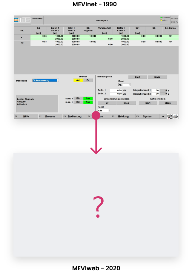
New measuring system receives new HMI

IMS Messsysteme GmbH offers producers and the processing industry of aluminum, steel and non-ferrous metal products a broad product portfolio of precision measuring systems. The HMI for monitoring the measured values and for controlling the measuring system was to be made more user-friendly in the course of a new product development.

PROJECT GOALS

MAXIMUM FLEXIBILITY THROUGH MODULARITY

Rather than designing fixed pages, a freely configurable modular system was to be created, which would make it possible to cater to various types of systems, as well as special customer wishes and requirements. Designs therefore had to be broken down into individual reusable components.

The requirements and goals were:

Responsiveness.

Creating a modular UI kit.

A flexible information architecture adaptable for different types of measurement systems.

Increase situational awareness through clear status feedback.

3 Themes.

PERSONAL GOALS

Gain as many UI / UX design skills as possible

This was my first pure UI/UX project. My goal was to get a foothold in the digital design sector and to complement my industrial design skills wherever possible.

I took every opportunity to learn new tools and methods to create an optimal user experience that is on par with current UIs.


INITIAL RESEARCH

COMPREHENDING the status quo

In order to understand the current state of the product and the user experience, me and my teammate applied various qualitative user research methods.

We conducted user interviews, field research, user observations and task analysis to understand how users interact with the old HMI, what tasks they have to accomplish and where problems occur in the product experience.

Field study

The field study provided important answers to contextual questions about the product. Before we started designing the HMI, we built a collective baseline understanding of the conditions under which the product would be used.

Understanding the product context, ...

... how the measuring system works ...

... and the role of the HMI. hamana

User interviews

We conducted a series of qualitative user interviews. These helped us to understand user goals and needs, as well as the tasks users need to accomplish with the HMI.


USER OBSERVATION

In order to understand the operators' user experience, we asked IMS employees to show us how they currently went about solving their tasks.


INSIGHTS & PROBLEMS

PINPOINTING ISSUES

After evaluating the initial research, many difficult problem areas emerged that we had to solve. The most important were:


Navigation

The navigation structure was not comprehensible. Via the bottom bar nested pop-up menus could be opened. Only the page title indicates the active menu item.
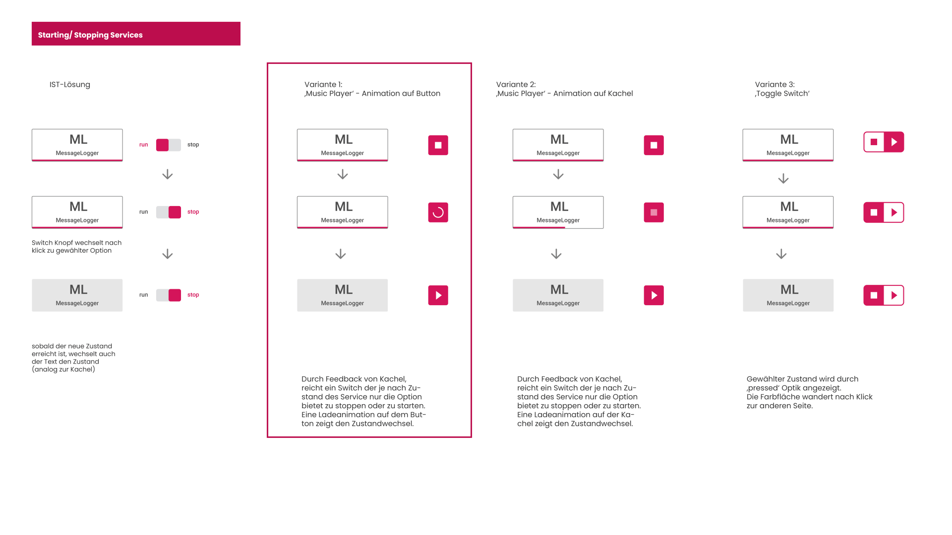
Button Feedback

Buttons flash in different colours depending on the action status. Colour codes must be learned by users. After stopping actions, it is not clear in which state the system has remained.

Process Visibility

Status feedback on ongoing operations was displayed in a small process window. Users cannot easily track the duration and progress of the process through the window.

Cumbersome user flows

Non-transparent page structure and lack of cross-links resulted in very cumbersome user flows in order to solve coherent series of tasks.
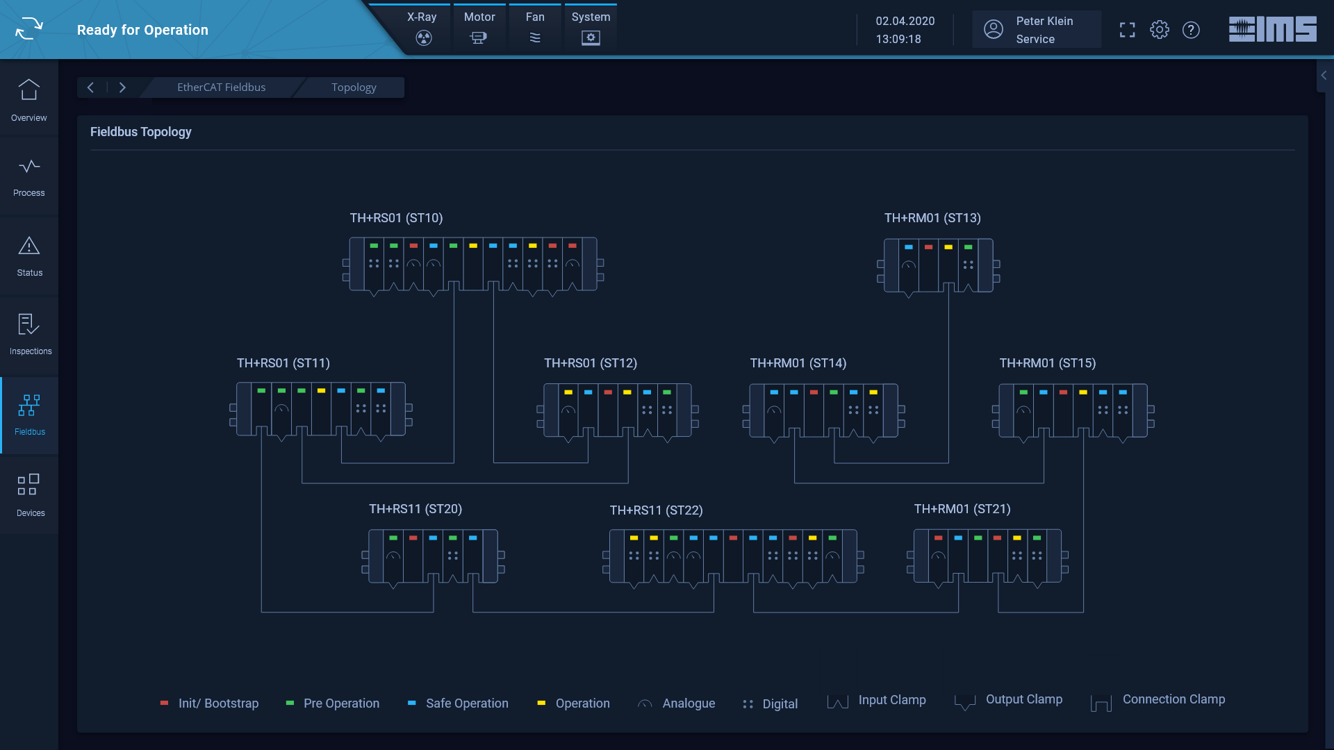

Information Design

Little variety in data visualisation. Mainly used: coloured backgrounds for data, charts and some measurement pointer diagrams. Information was mostly listed in tabular form.

Same controls on every page

The controls to perform the measuring functions were positioned on almost every page. These controls are of central importance in every interaction with the measuring system.


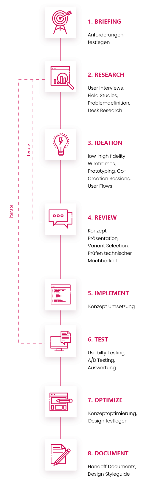
The development process

GOING ABOUT SOLVING THE ISSUES

The development of the components followed an iterative process, which was as follows:

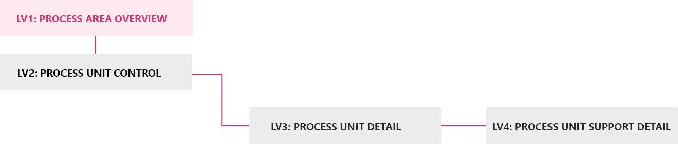
INFORMATION ARCHITECTURE

LINKING THE HMI LEVELS - IN ACCORDANCE WITH 'PROGRESSIVE DISCLOSURE'

I made sure to allow users to navigate from overview pages with the most important KPIs to lower-level pages with a variety of detailed information. I linked the HMI levels according to the principle of 'progressive disclosure'.

user flows

EXPLORING AND OPTIMIZING FLOWS 

User flows in form of low-fidelity wirefelows helped me to quickly uncover and optimise issues, as well as efficiently communicate opportunities. They also ensured that the focus of UX discussions was where it should be: on user experience rather than UI design.
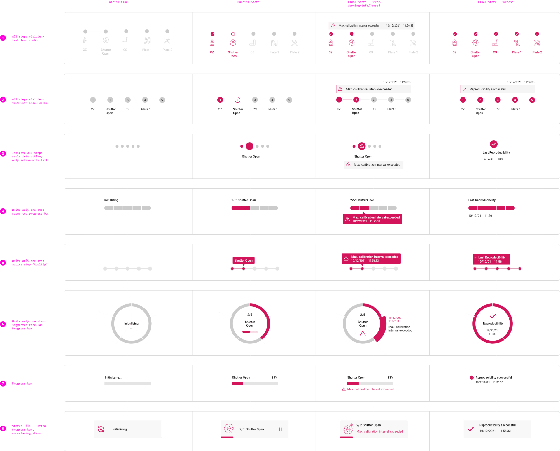
wireframing

IDEATING CONCEPTS

I used low-to-high-fidelty wireframes to conceptualise and design components. I always created multiple concept variants and discussed advantages and disadvantages of different approaches with the team. After internally agreeing on concept favourites, I steadily refined them. Afterwards, I created handoff documents and consulted with developers to ensure that the design was implemented in detail. The components went through several iterations until the final implementation. 

motion design

IT FEELS LIKE SOMETHING IS MISSING

After the basic framework of the HMI was implemented, I interacted with the rudimentary prototype and realised that one important component was missing:

Motion Design.

Particularly unpleasant were static waiting times that occurred when navigating and interacting with components such as buttons and switches.


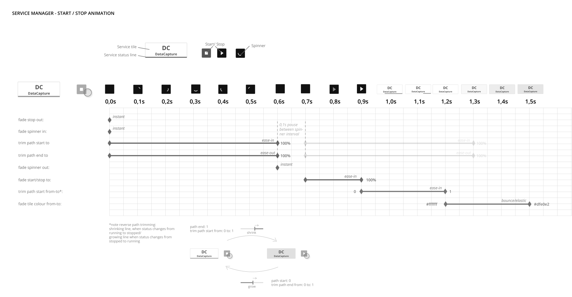
To remedy the situation, I familiarised myself with the principles and best practices of motion design and learned how to animate UI Designs using Adobe After Effects. After 2 weeks of training, I began integrating animated design concepts into the development process where appropriate.


I sketched out storyboards, digitised and animated selected concepts. I optimized animation concepts in consultation with developers for feasibility and then prepared spreadsheets to handoff my designs. These ensured an accurate implementation of my motion concepts.

Collecting ideas

in sketch form

Storyboarding different concepts

Animating selected concepts


Final handoff document

FINAL DESIGN

FLEXIBle. MODULAR. SMART.

The MEVIweb HMI design boasts a modern dashboard look. The HMI not only features a modern information design, but also motion design to create an optimal user experience.

Final Design

FLEXIBle. MODULAR. SMART.

The MEVIweb HMI design boasts a modern dashboard look. The HMI not only features a modern information design, but also motion design to create an optimal user experience.

Information design

CLEAN DESIGN FOR HEIGHTENED FOCUS

On overview pages, the visual presentation of data contributes significantly to better situational awareness. The user's focus is specifically directed through the use of appropriate graphic elements and a carefully considered layout.

Information design

CLEAN DESIGN FOR HEIGHTENED FOCUS

On overview pages, the visual presentation of data contributes significantly to better situational awareness. The user's focus is specifically directed through the use of appropriate graphic elements and a carefully considered layout.

CONTROL PANEL

CORE FUNCTIONALITY ON QUICK ACCESS

The control panel, which is fixed to the edge of the page, allows the user to access the most important functions of his measuring system from any page. Cleverly used microinteractions illustrate system states and loading processes.

CONTROL PANEL

CORE FUNCTIONALITY ON QUICK ACCESS 

The control panel, which is fixed to the edge of the page, allows the user to access the most important functions of his measuring system from any page. Cleverly used microinteractions illustrate system states and loading processes.

CONTROL PANEL

CORE FUNCTIONALITY ON QUICK ACCESS 

The control panel, which is fixed to the edge of the page, allows the user to access the most important functions of his measuring system from any page. Cleverly used microinteractions illustrate system states and loading processes.

INTERACTIVE GRAPHICS

self-explanatory graphics for intuitive operation

The design of graphic components is based on their functionality and their physical appearance, so that the user can quickly identify target objects.

Interactive graphics

self-explanatory graphics for intuitive operation

The design of graphic components is based on their functionality and their physical appearance, so that the user can quickly identify target objects.


PROCESS VISIBILITY

NO MORE GUESSING. KNOW WHERE YOU'RE AT.

The process indicator visualises complex multi-step processes and enables the user to follow their progress. Long waiting times become more bearable, as users can better assess the state of their system.

PROCESS VISIBILITY

NO MORE GUESSING. KNOW WHERE YOU'RE AT.

The process indicator visualises complex multi-step processes and enables the user to follow their progress. Long waiting times become more bearable, as users can better assess the state of their system.

3 THEMES

High performance Theming

The HMI offers themes for different environmental requirements. The light theme is suitable for use in bright environments. In subdued lighting conditions, the user can choose between the corporate blue theme and a neutral dark theme.

3 THEMES

HIGH PERFORMANCE THEMING

The HMI offers themes for different environmental requirements. The light theme is suitable for use in bright environments. In subdued lighting conditions, the user can choose between the corporate blue theme and a neutral dark theme.

MODULARITY

MAXIMUM FLEXIBILITY

The design consists of a comprehensive component library that allows free configurability of page designs. Special requests from customers?

No problem.

modularity

maximum flexibility

The design consists of a comprehensive component library that enables completely free configurability of page designs. Special requests from customers?

No problem.


modularity

maximum flexibility

The design consists of a comprehensive component library that allows free configurability of page designs. Special requests from customers?

No problem.

HMI Editor

Editing the HMI made easy

In addition to the HMI, I and my team colleague developed the UX/UI for the HMI's configurator. The page editor covers a wide range of functions. Besides page layout and configuration, data bindings, units, languages and theming can be created and managed from here.

HMI EDITOR

EDITING THE HMI MADE EASY

In addition to the HMI, I and my team colleague developed the UX/UI for the HMI's configurator. The page editor covers a wide range of functions. Besides page layout and configuration, data bindings, units, languages and theming can be created and managed from here.

THE BACKEND

DATA MANAGEMENT IN SMALL CHUNKS

In addition, I developed the UX for the backend tools, the M-Services. For each tool, I conducted user interviews, clarified requirements and designed suitable solutions.


the backend

DATA MANAGEMENT IN SMALL CHUNKS

In addition, I developed the UX for the backend tools, the M-Services. For each tool, I conducted user interviews, clarified requirements and designed suitable solutions.

CONCLUSION

MISSION ACCOMPLISHED.

I had the opportunity to try out a variety of methods and techniques in this project to refine and complement my skills as a designer. I discovered that I really enjoy understanding complex task processes and breaking down this complexity for users and making it easily accessible. Furthermore, I have learned agile working according to the SCRUM method in this project and am now able to manage design issues in a planned timeframe. I have also learned to work in interdisciplinary teams and to develop ideas in collaboration with developers, as well as to ensure a detailed implementation of

designs through consultation.

The goal of IMS to offer a modern, long-term competitive UI & UX was achieved as well as the increase of the UX maturity of the company. IMS has been sensitized to UX topics and understood the efficiency-increasing potential that good usability brings about. The result is an increasing number of projects with a focus on UX.

The design was recently awarded with the Red Dot Design Award 2021 which greatly honours me and motivates to keep going as ferociously as I always do. 

CONCLUSION

MISSION ACCOMPLISHED.

I had the opportunity to try out a variety of methods and techniques in this project to refine and complement my skills as a designer. I discovered that I really enjoy understanding complex task processes and breaking down this complexity for users and making it easily accessible. Furthermore, I have learned agile working according to the SCRUM method in this project and am now able to manage design issues in a planned timeframe. I have also learned to work in interdisciplinary teams and to develop ideas in collaboration with developers, as well as to ensure a

detailed implementation of designs through consultation. The goal of IMS to offer a modern, long-term competitive UI & UX was achieved as well as the increase of the UX maturity of the company. IMS has been sensitized to UX topics and understood the efficiency-increasing potential that good usability brings about. The result is an increasing number of projects with a focus on UX.

The design was recently awarded with the Red Dot Design Award 2021 which greatly honours me and motivates to keep going as ferociously as I always do. 

Other Projects

Share by: